Portrait vs Landscape Screens — Sizes, Resolution and Content Tips
When to use a portrait or landscape screen for digital signage, the image sizes to design at, how to mount and rotate a TV, and common mistakes.
By the onday team · · 4 min read
Whether to mount a screen upright or sideways is one of the first decisions in any signage project, and it shapes every piece of content you make afterwards. This guide explains when each orientation works, the sizes to design at and how to set a screen up correctly.
The quick answer
- Choose landscape for video, dashboards, menu walls above a counter, and anything made from slides.
- Choose portrait for posters, long lists, narrow walls, shop windows and door-side screens.
If you are unsure, go landscape. Most ready-made content is landscape, and it is easier to fill.
When landscape works best
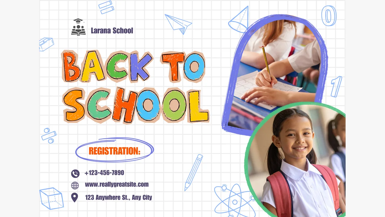
Landscape is the shape of television, video and presentation slides.
- Video. Nearly all video is shot wide. On a portrait screen it either shrinks to a strip or loses its sides.
- Dashboards and web pages. Most are designed for wide monitors.
- Slides. Google Slides and PowerPoint default to 16:9.
- Menu boards above a counter. A row of landscape screens reads naturally left to right.
- Meeting rooms and lobbies. People expect a wide screen at eye level or above.
When portrait works best
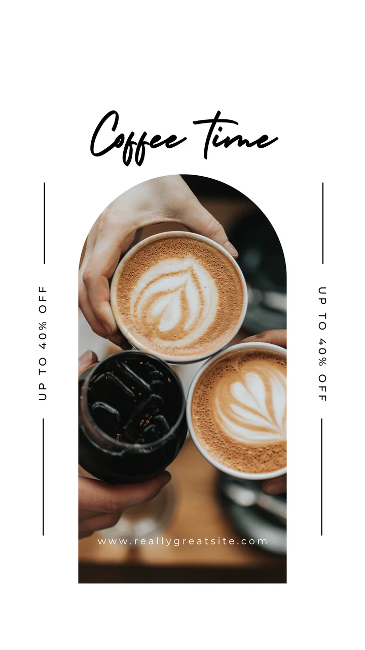
Portrait is the shape of a poster and of a phone.
- Posters and promotions. Existing print artwork is usually upright.
- Long lists. Menus, directories and timetables read top to bottom.
- Narrow spaces. Pillars, door sides and the gap between windows.
- Shop windows. An upright screen suits a full-height figure or product.
- Social content. Vertical video made for phones fills a portrait screen perfectly.
Sizes to design at
Design at the screen's resolution and the result will be sharp.
| Orientation | Full HD | 4K |
|---|---|---|
| Landscape | 1920 × 1080 | 3840 × 2160 |
| Portrait | 1080 × 1920 | 2160 × 3840 |
Both are a 16:9 ratio, one of them turned on its side.
Full HD is enough for almost all signage, even on a 4K TV. Text and flat graphics look the same from normal viewing distance, and the files are smaller and quicker to load. Use 4K where people stand close to a large screen and the content is photographic.
If you upload an image in a different shape, it will be fitted to the screen with bars at the edges. That is rarely what you want, so make separate versions for portrait and landscape screens.
Mounting a TV in portrait
Before you turn a TV on its side, check three things.
- The maker's guidance. Some consumer TVs are not designed to run upright, mainly because of how they shed heat. The manual or the maker's support pages will say. Commercial displays are usually rated for both orientations.
- The bracket. It must be rated for the weight and allow portrait mounting. The VESA mounting pattern on the back of the TV tells you which brackets fit.
- Which way up. Turning the TV one way puts its vents and inputs at the top, the other way at the bottom. Follow the maker's advice if there is any.
Rotating the content
Mounting the TV upright does not rotate the picture. The TV still thinks it is landscape, so something has to turn the content.
In onday you set each screen's orientation in the dashboard. Everything that screen plays is rotated to match, including the idle screen. There is an option for each direction of portrait and for landscape upside down, which covers every way a screen can be mounted.
If a single video plays sideways because of how it was filmed, it can be given its own rotation in the media library.
Designing for each shape
Landscape
- Think in two or three columns.
- Keep important content away from the outer edges. Some TVs crop slightly.
- A headline, one image and one line of detail is plenty.
Portrait
- Think in stacked bands: headline at the top, image in the middle, detail and call to action below.
- Eye level matters. On a tall floor-standing screen the bottom third is below most people's sightline, so put the key message in the upper two thirds.
- Lists work well, but keep the type large.
Both
- One message per slide.
- High contrast between text and background.
- Show each slide for 8 to 12 seconds. Longer for a menu, shorter for a single line.
Mixing orientations
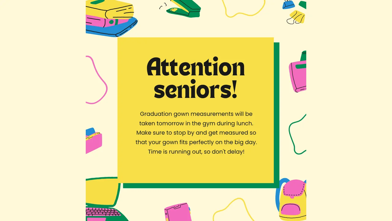
Most sites end up with both. A café might have landscape menu screens above the counter and a portrait screen in the window.
Keep separate playlists for each shape. Naming them clearly helps: "Window – portrait" and "Counter – landscape". Group screens by orientation so one schedule covers each set.
When you commission artwork, ask for both shapes at the start. Adapting a landscape design to portrait afterwards is slower than making two versions at the same time.
Common mistakes
- Stretching. Never stretch an image to fit. Redesign it.
- Landscape video on a portrait screen. It will sit in a narrow band. Shoot or crop a vertical version.
- Tiny text. A poster designed for A4 print has type far too small for a screen viewed from across a room.
- Ignoring the TV's own sleep settings. These apply whichever way up it is. Turn off automatic power-off.
Try both
onday lets you set orientation per screen, so you can test a portrait layout on any display before you buy a bracket. Create a free account, pair a screen and switch its orientation in the dashboard. For hardware options, see how to turn a TV into a digital sign.